MOTION DESIGN MIXED MEDIA
MOTION DESIGN MIXED MEDIA
CONCEPT & DESIGN
CONCEPT & DESIGN
Publication
Publication
EDITING & POST-PRODUCTION
EDITING & POST-PRODUCTION
Relevant Parties
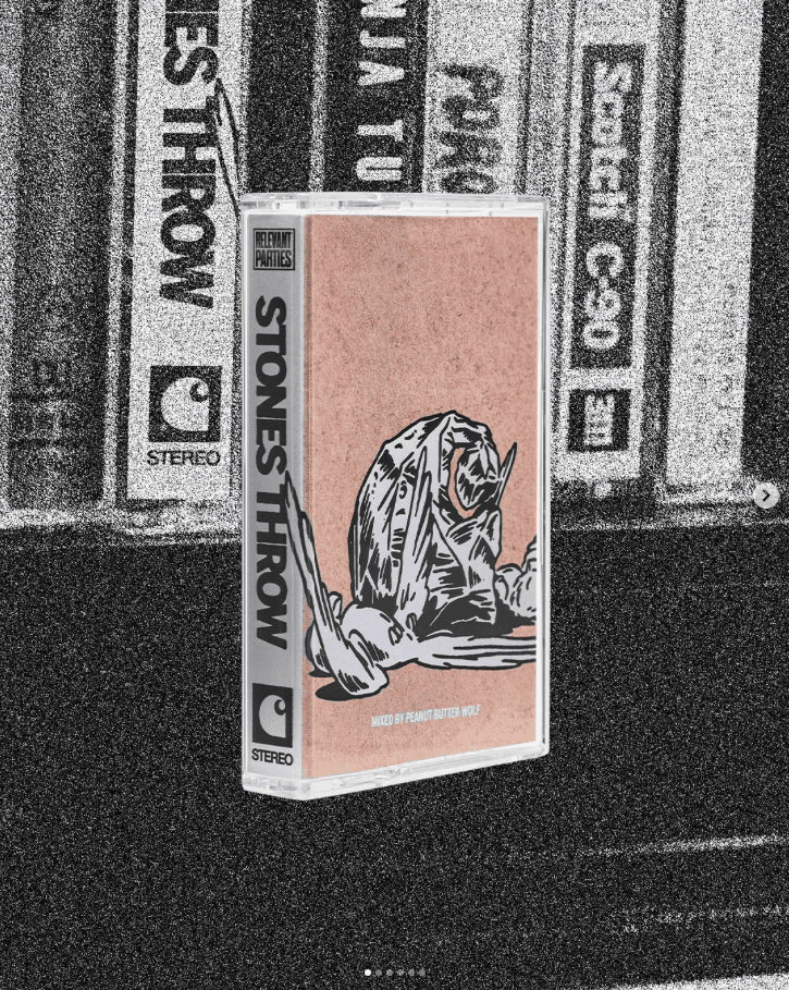
RELEVANT PARTIES by Carhartt WIP was a monthly podcast series exploring groundbreaking independent record labels worldwide, including Stones Throw, Ninja Tune, Ghostly International, DFA Records, Jazzy Sport and Public Possession. Hosted by music journalist Chal Ravens, the series focused on the people behind the music and the idealism and persistence required to run a label. Released in two volumes of six labels each, every episode was accompanied by a limited cassette with a mix curated by the label and a capsule collection, while a zine brought the project together in print.
The cassette tape was chosen as the central medium and became the foundation of the entire visual communication. Concept, footage and edit of the motion design for every episode were developed and produced in collaboration with illustrator Hans Berger, who contributed the illustrative layer and storyboards. Close-up scenes of cassette decks springing open and tapes being inserted and rewound were shot on a Hi8 camera.
To transfer the camera signal onto an old ISP CRT radio TV, a suitable RF modulator was tracked down, turning frequency interference, rolling lines and signal noise into a defining part of the visual language. The footage was played back on the CRT screen, re-filmed and combined with stop-motion sequences and illustrations into 13 short clips: opening teaser for the series and twelve trailers, one for each label's episode, all adapted for social media.
RELEVANT PARTIES by Carhartt WIP was a monthly podcast series exploring groundbreaking independent record labels worldwide, including Stones Throw, Ninja Tune, Ghostly International, DFA Records, Jazzy Sport and Public Possession. Hosted by music journalist Chal Ravens, the series focused on the people behind the music and the idealism and persistence required to run a label. Released in two volumes of six labels each, every episode was accompanied by a limited cassette with a mix curated by the label and a capsule collection, while a zine brought the project together in print.
The cassette tape was chosen as the central medium and became the foundation of the entire visual communication. Concept, footage and edit of the motion design for every episode were developed and produced in collaboration with illustrator Hans Berger, who contributed the illustrative layer and storyboards. Close-up scenes of cassette decks springing open and tapes being inserted and rewound were shot on a Hi8 camera.
To transfer the camera signal onto an old ISP CRT radio TV, a suitable RF modulator was tracked down, turning frequency interference, rolling lines and signal noise into a defining part of the visual language. The footage was played back on the CRT screen, re-filmed and combined with stop-motion sequences and illustrations into 13 short clips: opening teaser for the series and twelve trailers, one for each label’s episode, all adapted for social media.
CLIENT
CLIENT
ART DIRECTOR
ART DIRECTOR
CONPECT & Design
CONCEPT & DESIGN
CONcept & Design
Sound
Sound
CARHARTT WIP
CARHARTT WIP
TIM KOTTMANN
TIM KOTTMANN
Sarah Schweizer
Sarah Schweizer
Hans Berger
Hans Berger
Max graef
Max graef
Vol. 01
Vol. 02
VOL. 01
VOL. 02


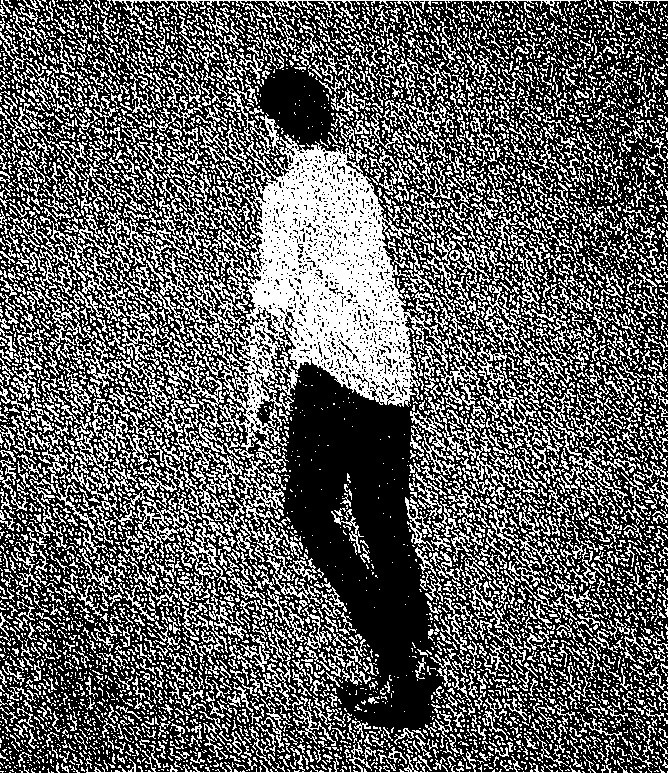
The lookbook was conceived, planned and art directed by the same team and shot in-house at the Carhartt WIP studio, extending the visual world of the clips into still imagery. Its concept carried the models as miniatures into the black-and-white universe of the films, inserting and labeling oversized cassettes while wearing the collection. Only the merchandise kept its color, putting the product in focus of every image.
The lookbook was conceived, planned and art directed by the same team and shot in-house at the Carhartt WIP studio, extending the visual world of the clips into still imagery. Its concept carried the models as miniatures into the black-and-white universe of the films, inserting and labeling oversized cassettes while wearing the collection. Only the merchandise kept its color, putting the product in focus of every image.
PHOTOGRAPH
PHOTOGRAPH
Styling
Styling
Andrew white
Andrew white
Aya Takeshima
Aya Takeshima


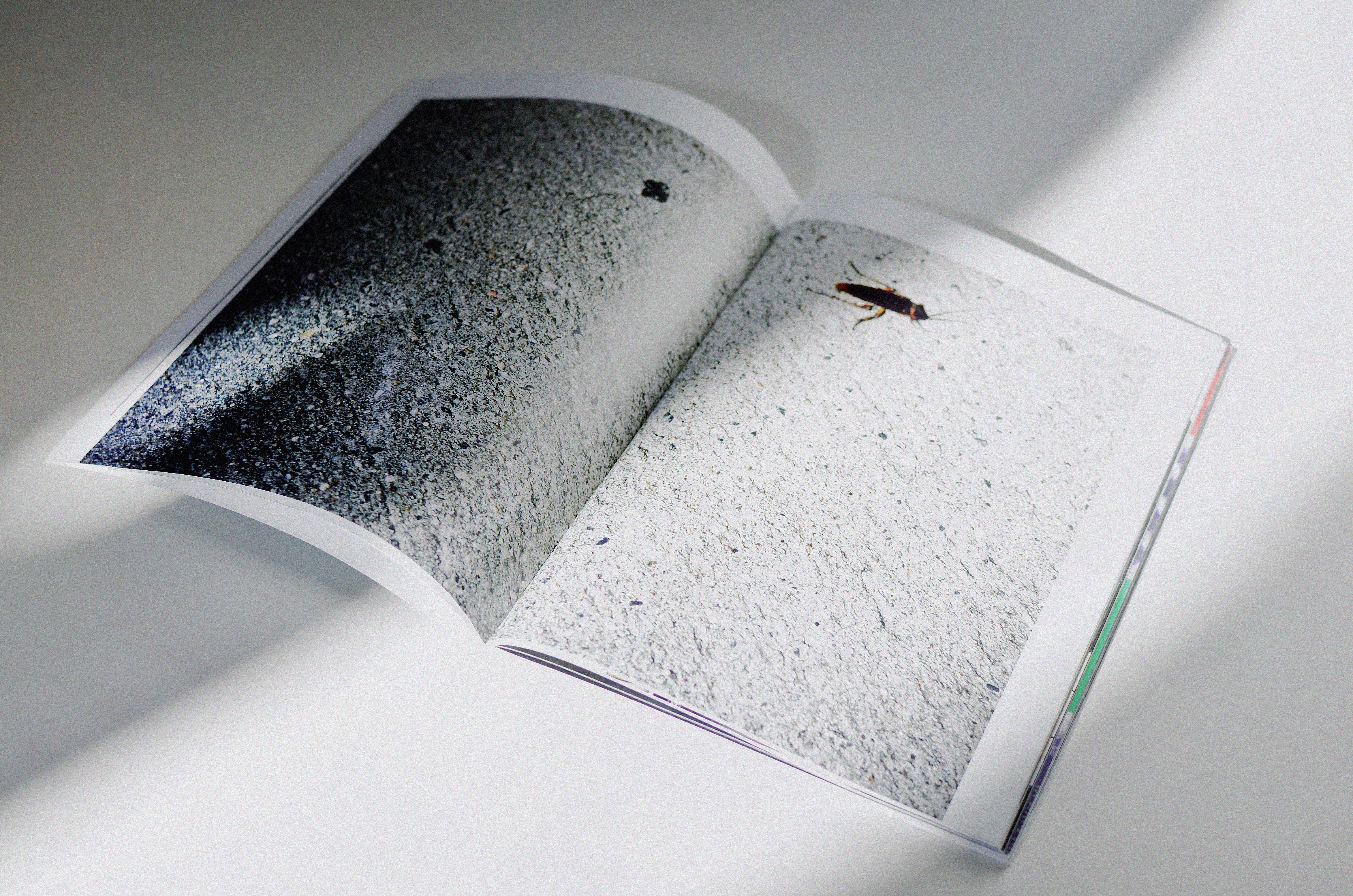


The accompanying zine offered insights into the offices and studios of the featured labels and gave the series a printed counterpart. Design and layout were developed in-house, with production supervised through to print.
The accompanying zine offered insights into the offices and studios of the featured labels and gave the series a printed counterpart. Design and layout were developed in-house, with production supervised through to print.
Designer
Designer
Printing
Printing
Sarah Schweizer
Sarah Schweizer
Druckhaus Sportflieger Berlin
Druckhaus Sportflieger Berlin