CARHARTT WIP RADIO SHOW

/

MOTION DESIGN

/

ART DIRECTION

12th Isle

Concept & Visual Language

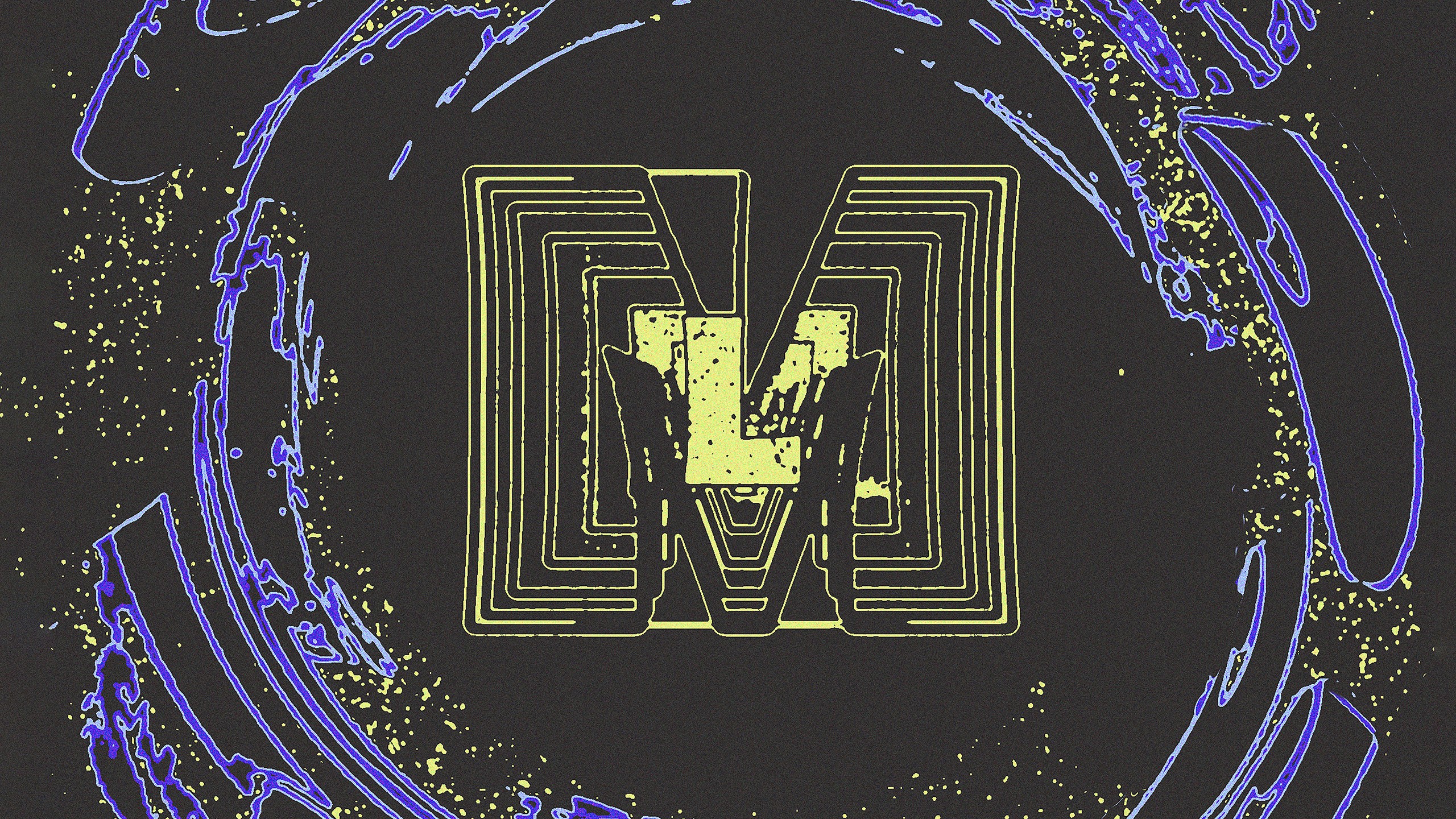
For Carhartt WIP Radio's Label Feature "12th Isle," I translated the label's own visual mythology into a moving piece. 12th Isle's world is built on cartography contour lines that trace directly back to the label's founding story of a mist-shrouded island. Al White's artwork for the label consistently leans into a screen-print or riso aesthetic, flat duotone and tritone color blocks, coarse halftone grain, dense linework, closer to an etched map than a clean vector system. I picked up that same visual vocabulary and carried it into motion, staying within the label's muted, oceanic palette (navy, dusty pink, mint) and its labyrinthine, handmade character. To bring in the way 12th Isle labels its physical releases, a plain paper sleeve with an applied info sticker, I mirrored that logic in the final key visual: the artwork itself carries no printed text, instead a sticker-style info field sits on top with the date, show name and label title, functioning exactly like a hand-applied label would on one of their record sleeves.


For Carhartt WIP Radio's Label Feature "12th Isle," I translated the label's own visual mythology into a moving piece. 12th Isle's world is built on cartography contour lines that trace directly back to the label's founding story of a mist-shrouded island. Al White's artwork for the label consistently leans into a screen-print or riso aesthetic, flat duotone and tritone color blocks, coarse halftone grain, dense linework, closer to an etched map than a clean vector system. I picked up that same visual vocabulary and carried it into motion, staying within the label's muted, oceanic palette (navy, dusty pink, mint) and its labyrinthine, handmade character. To bring in the way 12th Isle labels its physical releases, a plain paper sleeve with an applied info sticker, I mirrored that logic in the final key visual: the artwork itself carries no printed text, instead a sticker-style info field sits on top with the date, show name and label title, functioning exactly like a hand-applied label would on one of their record sleeves.


Client

Client

Art Director

Art Director

Year

Year

Carhartt WIP & 12th Isle

Carhartt WIP & 12th Isle

Sarah Schweizer

Sarah Schweizer

2025

2025

Execution & Rollout

At the center of the animation is a stylized plant motif, hand-drawn by me and closely tied to 12th Isle's own logo. I animated it using stop motion, letting the plant grow frame by frame rather than through conventional keyframe interpolation. I deliberately kept the frame rate low, so the motion itself carries the same choppy, printed quality as the label's static posters rather than reading as smooth digital animation. In After Effects, I layered several distortion filters over the footage and finished with a Colorama pass, remapping the tonal values into flat color bands, which produced the contour-line, topographic look that runs through the whole piece. The key visual was printed as a poster and displayed in stores, while the finished animation ran across social media and on every Carhartt POS screen.

OTHER

OTHER PROJECTS

PROJECTS

Get in touch